Webform
Webform
The Webform component places a form built with Drupal’s Webform module — a contact form, an event RSVP, a multi-step application — inside a Page Builder page. Like Views, you are placing something that is managed elsewhere: the form’s questions, validation and notifications live under Structure › Webforms; the component decides where on the page the form appears and how the section around it looks.
What it is for
Any page that needs to collect something from the visitor without sending them away: a “request a demo” band at the end of a product page, a feedback form under an article, a registration form in the middle of an event page. The form posts back to the same page and confirms in place, so the visitor never leaves the layout you built.
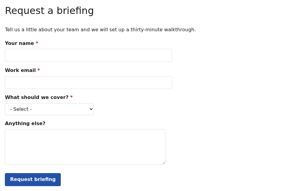
See it live on the example page APB Webform.
Structure
- The Webform component holds the section title, intro text, layout settings and the reference to one form.
- There are no nested items: the fields shown to the visitor are the form’s own elements, edited in the Webform builder, not in the Page Builder.
Because the form is referenced rather than copied, changing a question in the Webform builder changes it on every page that embeds the form. Conversely, swapping the form in the component’s dropdown replaces the whole form on that page in one move.
Component settings
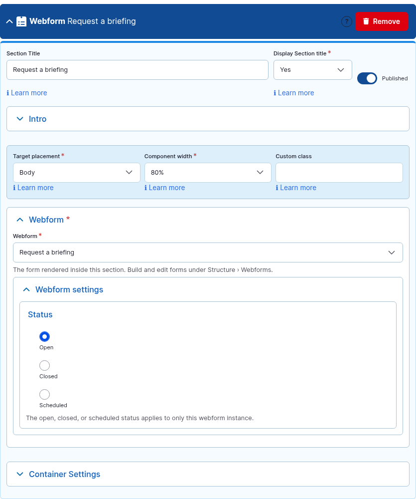
| Setting | Options | Default | What it does |
|---|---|---|---|
| Section Title / Display Section title / Intro Text | — | — / No / empty | Heading and lead paragraph above the form. See Section Title and Intro Text. |
| Target Placement | Body, Main Content Top/Bottom, Top region, Sidebars, Internal Placement 1–3 | Body | Where on the page the form section is shown. A sidebar placement is a good fit for a short contact form. See Target Placement. |
| Component Width | 25% … 100% | 100% | Narrows and centers the section. Forms read better at 60–80% on wide pages; the fields themselves keep the widths set in the Webform builder. See Component Width. |
| Custom Class | text | empty | See Advanced settings. |
| Webform | every form on the site | — (required) | The form to show. Only forms that already exist appear; create or edit forms under Structure › Webforms. |
| Status | Open, Closed, Scheduled | Open | Overrides the form’s status for this placement only. Closed shows the form’s closed message instead of the fields; Scheduled opens and closes it on the dates you set. The form’s own status still applies everywhere else. |
| Container Settings | — | 32px bottom margin | Padding, border and background for the section, including a background image behind the form. See Container Settings. |
How to use it
- Make sure the form exists: Structure › Webforms › Add webform, add the elements, save. This is a one-time job per form, usually done by whoever owns the form and its notifications.
- On the page, click Add Webform. Give the section a title and, in Intro, a sentence telling the visitor what happens after they submit.
- Pick the form in the Webform dropdown. Leave Status on Open.
- Set Component Width to 60–80% for a single-column form, and save. Open the page logged out and send a test submission; it appears under Structure › Webforms › Results for that form, tagged with the page it came from.
A form inside another component
Where you need a form next to other content rather than in its own band — inside a Simple Content column, a Tabs panel or an Accordion item — type the token into that component’s text field, using the form’s machine name (shown in the Webforms list, for example request_a_briefing). The token is replaced by the live form when the page is displayed. The APB Full HTML text format carries this filter by default.
Tips
- Set the form’s confirmation to Inline (in the Webform builder, under Settings › Confirmation) so the thank-you message appears in the section instead of on a separate page. A confirmation URL also works when you want to send the visitor elsewhere.
- Do not embed the same form twice on one page — through two components, or a component plus a token. The second copy shares HTML ids with the first and browser validation gets confused. Two different forms on one page are fine.
- Short forms belong beside content (a sidebar placement or a token in a Simple Content column); anything with several steps deserves its own band at 100% width.
- The visitor sees the form in the site’s interface language, not the page’s content language: translate the form’s labels under Structure › Webforms › Translate.
- Anyone who cannot access a form (a staff-only form on a public page, for example) sees the form’s access-denied message inside the section, never the fields. Check the form’s Access settings if a form is missing for visitors.
For site builders
| Item | Value |
|---|---|
| Module | apb_pb_webform |
| Paragraph types | apb_pb_webform (no item bundle) |
| Requires | apbuilder, Paragraphs, Entity Reference Revisions, Field Group, Filter, Taxonomy, Text, and contrib webform ^6.3 (webform_ui recommended so editors get the form builder) |
| Own config | field field_apb_wf_webform (type webform, formatter webform_entity_reference_entity_view with source entity, so the form id and confirmation are unique per paragraph); text filter apb_webform_embed (apb_full_html at install |
| Shared vocabularies | apb_tax_width, apb_tax_target_placement |
| Front-end | apb_pb_webform/frontend: spacing only; Webform ships its own element styles and behaviours (Ajax, states, wizard progress). |
| Permissions | Install grants view to anonymous and authenticated, and create / update / delete to authenticated, content_editor and editor. Who may submit a form is decided by the form’s own access settings. |
| Container settings | Full profile; selector #apb-wrapper #apb-webform-{id}. |
| Not supported | Forms inside Overlay Content payloads (the overlay is fetched as JSON and has no form context — link to the form’s own /form/… page instead); the same form twice on one URL. |
| Example page | /apb/apb-webform |