
By default a component is printed in the page body, in the order of the cards. Target Placement lets you send it somewhere else on the page instead — above the title, into a sidebar, edge to edge across the main column, or into a cell of a Simple Content grid — without touching the theme.
Where to find it
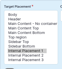
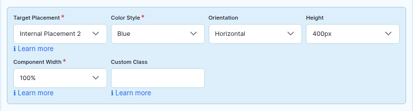
Target Placement is the first drop-down of the light-blue Config row on every component. It is required; the default is Body.
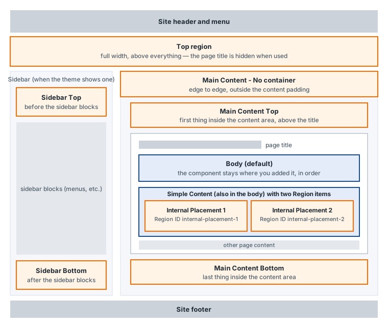
The areas of the page
| Option | Where the component appears | Notes |
|---|---|---|
| Body (default) | Exactly where the card sits in the Page Builder list, at the position of the Page Builder field in the page (usually after the Body text). | Use this unless you have a reason not to. Order follows the cards. |
| Main Content Top | At the very top of the main content column — above the page title when the theme prints the title inside that column, as the APB theme does. | Good for a slideshow or banner that must come before the title. If several components use it, the one lowest in the card list ends up on top. |
| Main Content Bottom | At the very end of the main content column, after everything else on the page. | Good for a call-to-action, related links or a footer-like block. Several components keep their card order. |
| Main Content - No container | Above the main content, but outside the normal content padding, so the component can stretch from edge to edge of the main column. | Use for full-bleed backgrounds. The section title gets an inner wrapper so the text still lines up with the rest of the page. |
| Top region | Directly under the site header, across the full width of the page, before the sidebar and the main column. | Designed for hero slideshows. The page title is hidden when a component is placed here, because the hero is expected to carry its own heading. |
| Sidebar Top | In the sidebar, before the sidebar blocks (menus, etc.). | Only works on pages where the theme actually shows a sidebar. Keep the component narrow: a links list, a small profile. |
| Sidebar Bottom | In the sidebar, after the sidebar blocks. | Same conditions as Sidebar Top. |
| Internal Placement 1, 2, 3 | Inside a Region cell of a Simple Content component on the same page whose Region ID is internal-placement-1, -2 or -3. |
This is how you put any component inside a column of a Simple Content grid — an Accordion next to a text, Tabs under an image. The slot is created by the editor, not by the theme; see below. |
| Header (this site only) | Immediately before the page-title block. | Not part of the standard set; it was added on the demo site. Your site may have similar extra options. |
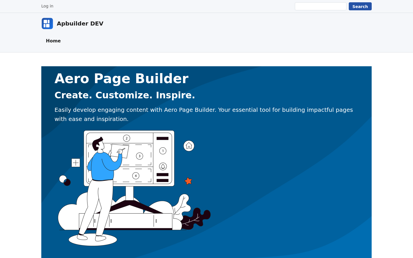
Example: a slideshow in the Top region
Internal Placements: a component inside a Simple Content
The three Internal Placement options do not point at a fixed spot in the theme. They point at a Region item of a Simple Content component on the same page. Simple Content is the layout grid of the Page Builder; a Region is an empty cell in that grid, and Target Placement is what fills it. This is the standard way to place an Accordion, Tabs, a Carousel or any other component inside a column, next to text or an image.
- Add (or open) a Simple Content component and give it the columns you need.
- Add a Region item where the component should appear and type the Region ID
internal-placement-1(or-2,-3). The other cells stay Content items with text or images. - Add the component you want to insert as a normal card in the Page Builder list — before or after the Simple Content, it does not matter — and set its Target Placement to Internal Placement 1 (matching the Region ID).
- Save. On the page the component is moved into the cell; in the editor it stays a separate card.
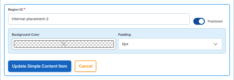
- Each Region ID can be used by one Region per page; the editor refuses duplicates. With the three standard IDs you can host three inserted components per page (each Region can receive several components, inserted last-card-first).
- Any other Region ID (letters, digits, hyphens, underscores) also creates an anchor, but only the three
internal-placement-NIDs have a Target Placement option. Custom IDs need a matching term added by an administrator. - If the Region is missing, unpublished or has a different ID, the inserted component stays hidden — check the spelling first.
- The component keeps its own settings (width, color style, container settings); the Simple Content cell only provides the position and the column width.
Rules worth knowing
- The move happens in the browser. The component is still saved as part of the page; it is relocated when the page is displayed. Its Component Width percentage then applies to the area it was moved to.
- Missing area = hidden component. If the chosen area does not exist on the page (no sidebar on this page, no Simple Content Region with the matching ID), the component stays hidden rather than falling back to the body. When a component “disappears”, check this setting first.
- Only the areas the page provides. The list is the same for every content type, but whether an area exists depends on the theme (sidebars, Top region) or on the content of the page (Internal Placements). When in doubt, try it and look at the page.
- Order in a shared area. Components sent to the same area keep their card order, except in Main Content Top and the Internal Placements, where each component is inserted at the start of the area — so the last card ends up first. Drag the cards to adjust.
- Container settings and section title travel with the component. Backgrounds, borders, padding and the section title are all moved together.
Tips
- Reserve Top region for one hero component per page; two full-width slideshows stacked under the header rarely look intentional.
- Keep sidebar components light. Ten columns of feature boxes in a 300-pixel sidebar will collapse to a single column and become very tall.
- If a component must appear in the same area on many pages, ask your administrator whether a block would serve better; Target Placement is meant for per-page decisions.