
Simple Content is the layout component of APB. It draws a grid of one to several columns and lets you fill the cells with rich text, images (one image or a small slideshow), a background, or a Region — an empty slot into which any other component can be inserted. Most multi-column pages are built with it.
What it is for
Whenever the page body is not enough: text beside an image, two or three text columns, a colored band with a heading, an accordion next to a paragraph, a call-out box. Simple Content provides the columns; the items provide the content; other components plug into its regions.
See it live on the example page APB Simple Content. Several other example pages (Carousel, Image Gallery, Tabs) use it to place a component beside text.
Structure
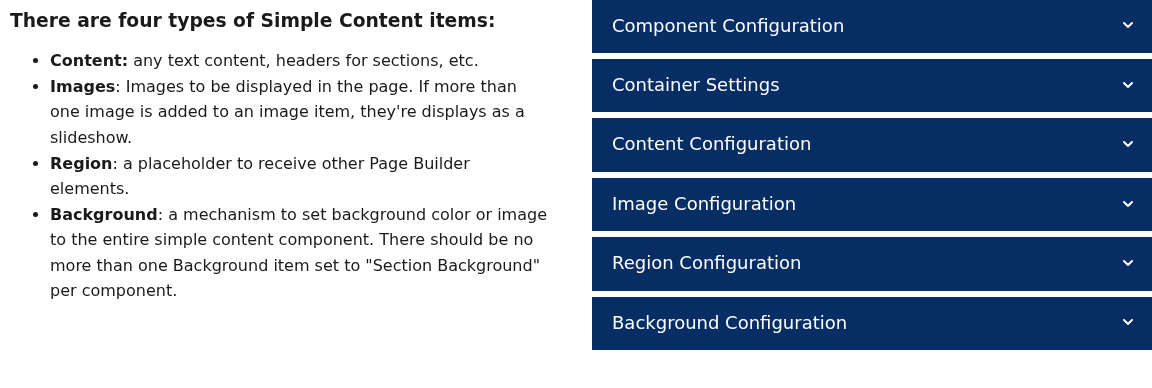
The component defines the grid. Its items are placed into the grid cells in order, left to right, then next row. There are four item types:
| Item type | Purpose |
|---|---|
| Content | A cell of rich text: headings, paragraphs, lists, inline images, links. |
| Images | A cell with one image or, when several are uploaded, a small slideshow of them, cropped to a chosen aspect ratio. |
| Region | An empty cell with an ID. Any component whose Target Placement matches that ID is moved into the cell. |
| Background | Not a cell in the usual sense: a color or image (optionally with parallax) applied behind the whole component, behind the items area, or as a colored block in one cell. |
Item titles are for editors only; none of them is shown on the page. Give each item a descriptive title (“Left text”, “Region 1”) so the items table stays readable.
Component settings
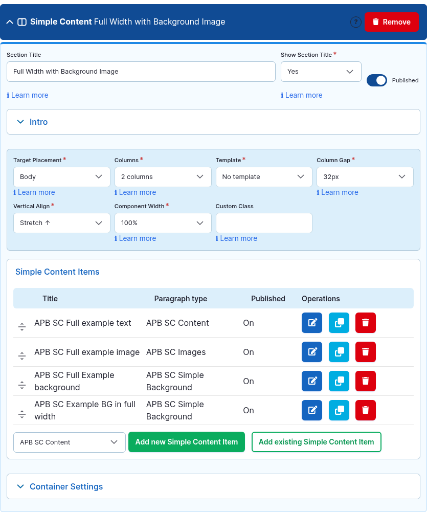
| Setting | Options | Default | What it does |
|---|---|---|---|
| Section Title / Show Section Title / Intro Text | — | — / No / empty | Heading and intro above the grid. See Section Title and Intro Text. |
| Target Placement | Body, Main Content Top/Bottom, Top region, Sidebars, Internal Placement 1–3 | Body | See Target Placement. A Simple Content can itself be placed in the region of another Simple Content. |
| Columns | 1 … 10 | 1 | Number of equal columns. See Columns and Column Gap. |
| Template | No template; for 2 columns: 50/50, 33/67, 67/33, 25/75, 75/25; for 3 columns: 33/33/33, 25/25/50, 50/25/25, 25/50/25, 20/40/40; for 4 columns: 25/25/25/25, 33/22/22/22, 22/22/22/33 | No template | Unequal column widths. Pick a template whose column count matches Columns; the numbers are percentages from left to right. |
| Column Gap | 0 … 60px | 0px | Space between cells. |
| Vertical Align | Stretch, Top, Center, Bottom, Inherit | Stretch | How cells of different heights line up in a row. Stretch makes all cells the same height (needed for background colors to fill the row); Center centers a short text beside a tall image. |
| Component Width | 25% … 100% | 100% | See Component Width. |
| Custom Class / Access Control | — | — | See Advanced settings. |
| Container Settings | — | 32px bottom margin | See Container Settings. For most backgrounds Container Settings is simpler than a Background item. |
Item fields
Content
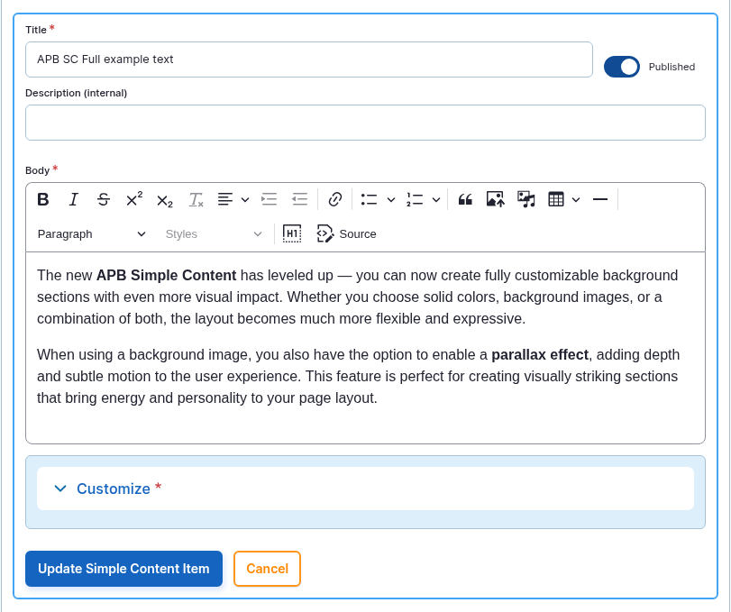
| Field | Required | What it does |
|---|---|---|
| Title | yes | Editor label only. |
| Body | yes | The rich text of the cell. |
| Vertical Align | yes (Inherit) | Overrides the component alignment for this cell. |
| Padding | no (0px) | Inner space of the cell, 0–60px. Needed when the cell has a background color. |
| Grid Column Span | no (Auto) | Make the cell span 2–5 columns or the full width — for a heading row above two columns, for instance. |
| Background Color | no | Fill color of the cell. |
| Description (internal) / Custom Class | no | Editor note / extra CSS class. |
Images
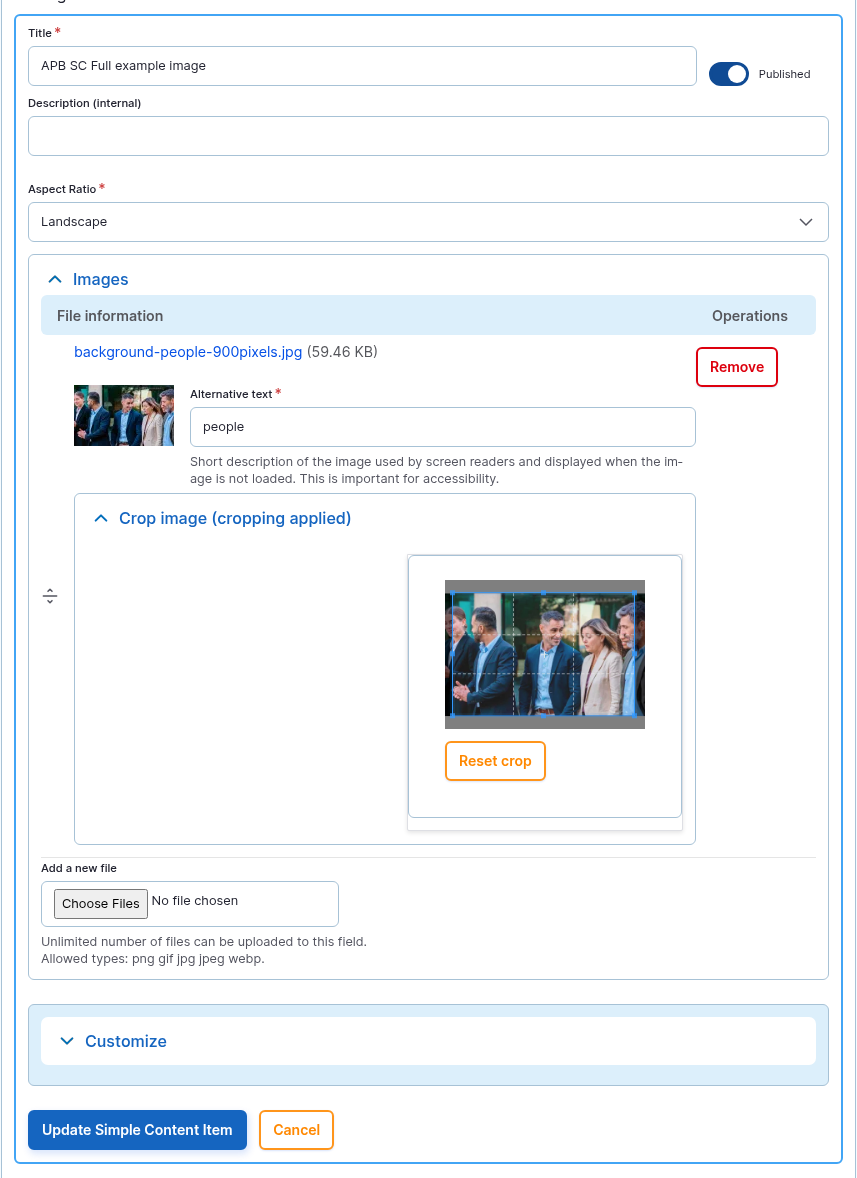
| Field | Required | What it does |
|---|---|---|
| Title | yes | Editor label only. |
| Images | no | One or more images. One image is shown as is; two or more become a slideshow with arrows. |
| Aspect Ratio | yes (Landscape) | Landscape, Portrait or Square crop applied to every image in the cell (adjust the crops after upload). |
| Padding / Background Color / Custom Class | no | As for Content. |
Region
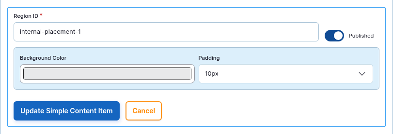
| Field | Required | What it does |
|---|---|---|
| Region ID | yes | The anchor other components target. To use the standard placements, type exactly internal-placement-1, internal-placement-2 or internal-placement-3; the inserted component then selects Internal Placement 1, 2 or 3 as its Target Placement. |
| Published | — | Unpublish the Region item to keep the cell in the grid but stop receiving components (they then stay hidden, see Target Placement rules). The internal Active Region flag is always on and not shown in the editor. |
| Padding / Background Color | no | As for Content. |
Background
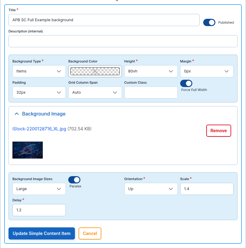
| Field | Required | What it does |
|---|---|---|
| Title | yes | Editor label only. |
| Background Type | yes (Content) | Section — behind the whole component including title and intro. Items — behind the grid only. Content — the item is itself a cell filled with the color/image (a colored block in the grid). Use at most one Section background per component. |
| Background Color / Background Image | no | Color and/or image. The image is scaled to cover. |
| Background Image Sizes | no (Large) | Which resized copy is loaded (Small … 2XL). |
| Height | yes (400px) | Minimum height of a Content-type background block (300px … 100vh). |
| Margin / Padding / Grid Column Span / Force Full Width | no | Spacing and span of the block; Force Full Width lets an Items background extend to the window edges. |
| Parallax, Orientation, Scale, Delay | no | Moves the background image slowly as the page scrolls (Up/Down/Left/Right); Scale enlarges the image so it has room to move, Delay smooths the motion. |
How to use it
Text beside an image:
- Click Add Simple Content. Set Columns to 2 and, if you want the image narrower, Template 67/33.
- Click Add new APB SC Content, write the text, click Create.
- Click Add new APB SC Images, upload the image, choose the Aspect Ratio, click Create.
- Set Vertical Align to Center and save.
Inserting another component in a column:
- In the Simple Content, add a Region item with Region ID
internal-placement-1. - Add the other component (Tabs, Accordion, Carousel, …) to the Page Builder as usual.
- In that component, set Target Placement to Internal Placement 1. Save: the component now renders inside the region cell.
Tips
- Item order equals cell order. Drag items to swap columns; no need to re-enter content.
- On small screens columns stack vertically in item order — put the most important cell first.
- Use Grid Column Span: Full Width on a Content item to add a heading row above a multi-column grid.
- Each Region ID can be used once per page; with three standard IDs you can host three inserted components per page. Any other unique ID also works if a designer targets it explicitly.
- Prefer Container Settings backgrounds for a plain band; use a Background item when you need parallax, a block inside the grid, or a background limited to the items area.
For site builders
| Item | Value |
|---|---|
| Module | apb_pb_simple_content |
| Paragraph types | apb_pb_simple_content; items apb_pi_sc_content, apb_pi_sc_images, apb_pi_sc_region, apb_pi_sc_background |
| Requires | apbuilder, Paragraphs, Entity Reference Revisions, Inline Entity Form, Field Group, Crop, Image Widget Crop, Better Formats, Color Field, Entity Access by Role Field, Field Formatter Class, Taxonomy Machine Name, core Image / Options / Taxonomy / Text |
| Own vocabularies | apb_tax_sc_template, apb_tax_sc_vertical_align, apb_grid_column_span, apb_image_sizes; crop types apb_image_landscape / _portrait / _square; image styles apb_image_* and apb_simple_content_bg_sm … _2xl |
| Shared vocabularies | apb_tax_columns, apb_tax_column_gap, apb_tax_width, apb_tax_target_placement, apb_tax_orientation, apb_tax_padding, apb_tax_margin, apb_tax_min_height |
| Front-end | apb_pb_simple_content/frontend: grid and template classes, Splide for image cells, simpleParallax for backgrounds, all driven by data-apb-sc-*. Region items render <div id="{Region ID}">, which core apb-placement.js uses as the placement target. |
| Container settings | Full profile on the component; cell backgrounds come from the items (apb_pi_sc_background), not from the shared container system. |
| Example page | /apbuilder_examples/apb-simple-content |